You have less than a second to earn attention in a feed. Good design is the difference between being seen and being skipped.
1. One idea per frame
If a post tries to say three things, it says nothing. Pick one message and design around it.
2. Contrast is king
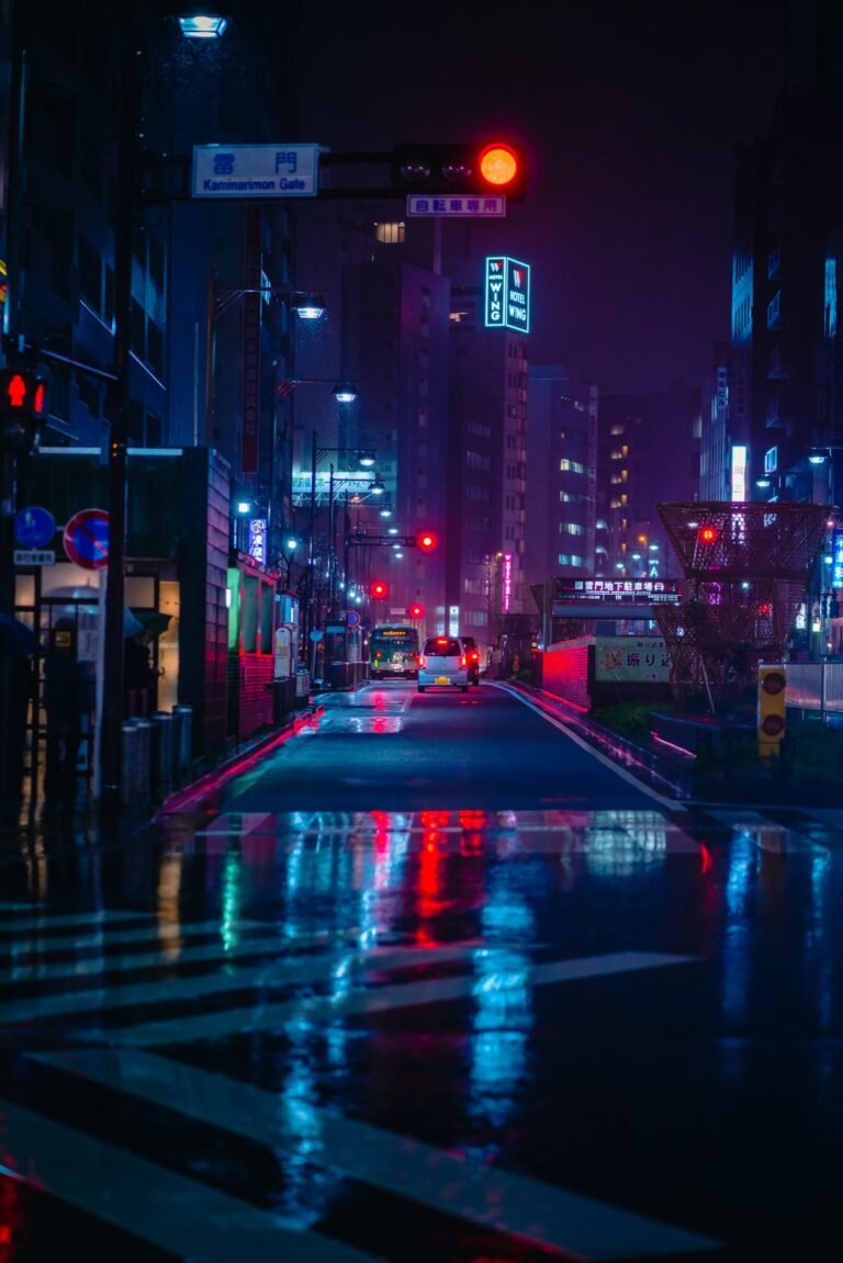
Strong colour and tonal contrast stand out on small screens — that’s why our own brand lives in orange and black.
3. Text that reads on mute
Most video is watched without sound. Big, clear captions keep your story working anyway.
4. Faces first
People look at people. A human face in the first frame lifts attention almost every time.
5. Consistency
A recognisable look makes every post work harder, because people know it is you before they read a word.